


Creation of the Bob Morane animated series LOGO
A logo is the signature of a series - an Image that becomes the symbol of the entire project. It should immediately communicate its spirit and essence. It eventually adorns all production documents, promotion, and is used for merchandising etc.
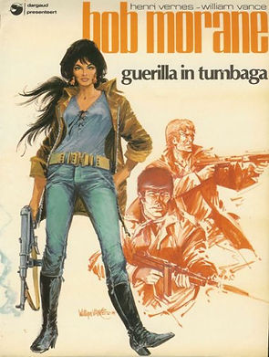
Graphically, Bob Morane existed long be fore the animated series, and we had a lot to inspire us . . .


I think we eventually found something very good. The logo For the animated series is modern and powerful, but at the same time has something classical about it that hints at some retro origins.
All of the designers contributed to the design, and many more contributed to the discussion. The final logo however was eventually conceived and executed by Meinert Hansen and Elie Klimos . . .

The logo was done in 2 colour themes, and variations were created in black and white and reduced versions for documents.


I personally was a big fan of the Marabout 'wave' lettering, and I added a stylized image of Bob Jumping from a small painted sketch of Bob that was done by Arthur Qwak (François Hemmen) during the graphic development phase. It was used for most of the production on documents, storyboard sheets, model packs etc. . . .


During the logo development, we explored in many directions for the design, and we had the luxury to be able to take our time to do it. I didn't save everything, but here are some of the sketches that I did find . . .
Here are some musings for lettering by Robert Rivard . . .


We thought about incorporating characters or some kind of image into the logo.
This is an early drawing of Bill and Bob with great style and silhouette - by Arthur Qwak . . .

More by Arthur Qwak

Variation on posing by Norman LeBlanc

Arthur Qwak


I think this is by Elie Klimos
Arthur Qwak

Norman LeBlanc


Arthur Qwak


Elie Klimos

A series by Elie Klimos I believe . . .


Unidentified . . .


This is the rough concept that became our logo . . . We had been disussing trying to emphasize the idea of cinema wide-screen aspect ratios, because we had convinced the production somewhat, that 16:9 HD TV was coming (It was difficult to do . . . ), and there was something powerfull about this sketch by
MEINERT HANSEN.

Meinert and ELIE KLIMOS collaborated on the final logo, and the final clean and lettering design was done by Elie.


Here is the final design
Here is a downloadable rar file of the logo in various file formats and sizes, that can be used for wallpaper etc.
Here is a downloadable rar file of the logo in various file formats and sizes, that can be used for wallpaper etc.